Physical distances are not the same as psychological distances. Physical distances are easy enough to measure, but how do we go about measuring psychological distances? The Mapped Web does this by taking the chance that given a page contains the name of one country it will also contain the name of another country as a measure for psychological distance. The resulting images show us how close countries are to each other in psychological terms.
This procedure can be extended to create maps for specific areas by including extra search terms. Look at all the pages on the Internet with the word War on them, which countries correlate? Probably countries that have something to do with each other in wars. The images below picture some of the relations between countries in this way.
A 200x200 matrix with the relative frequencies of country name combinations represents actually a 200 dimensional space with the countries as dots in between them. The trick is to reduce this amount of dimensions to two so we can actually plot something. This is usually done by a technique called Principal Component Analysis, where two new axis are constructed that represent the lot in the best possible way. The program here uses a different technology, the sammon algorithm. Here we just start with a random initial configuration. Over a number of iterations, we move the countries in the directions where they want to go, i.e. they are attracted to countries which they are closer to according to the matrix than according to the configuration and are repulsed by countries are too close to.
The results are the maps below. You can download two scripts, generateMatrix, which takes one parameter, the keyword, and generates a text file with the distances matrix for that keyword and stressOptimize, which generates the map. The latter uses the brilliant VPython visualization. The nice thing is that it is animated during the iteration, so you see what goes on. This project was largely done together with Ernst Wit, a fellow Savage Minder, who also came up with the initial idea.
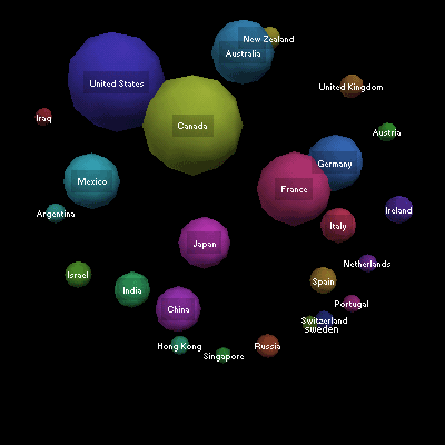
The World Map according to the Web

The upper part of the map is dominated by the Anglosaxion countries; To the right Europe sits, with Germany and France in ever closer union. The lower part of the map is Asia, with Japan the most central because westernized nation.
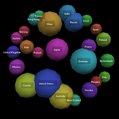
Economics relations in the world

In the middle, the powerhouses of the world, the US, Japan and Germany, with China and its two satelites Hong-Kong and Taiwan waiting in the wings. What about the cluster India, Russia and Israel? I don't really know, but they do correlate. May because they are relatively poor countries that do well on technology?
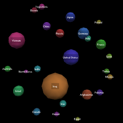
Wars of the world according to the web

The war map is spread out and tense; so many wars, so little space on this bitmap. The second world war axis are visible in the right corner, as are the axis of evil in the lower right corner. Russia, China and Japan form an uneasy triangle of historic conflict. The US is in the middle of everything.
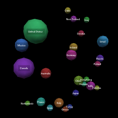
Immigration streams

Ireland and Germandy are in the middle, as large contributors to American immigration, but destinations themselves nowdays. The big immigration countries keep their distances from the others and warp the map a bit; immigration isn't that much an issue there as it is for the exporters of people in Asia, who are much closer to each other.
Downloads
- stressOptimize.py
- calculates the stress and plots the maps. Needs VPython
- generateMatrix.py
- Does the searches and produces a matrix with the data for stressOptimize