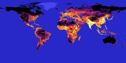
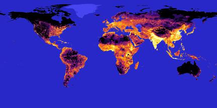
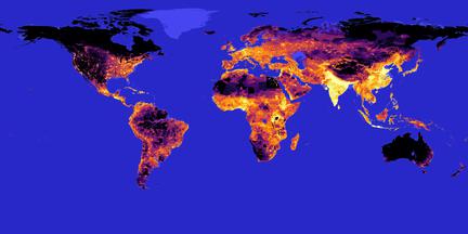
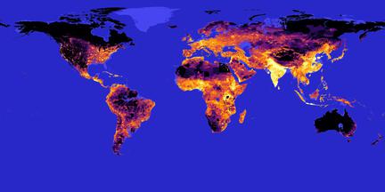
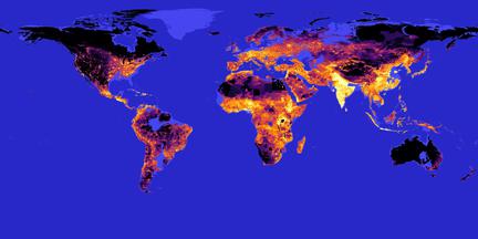
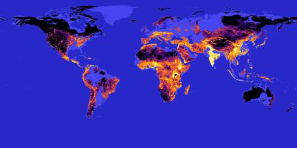
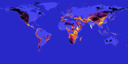
Click on the thumb-nails to see what the world map looks like given a certain amount of sealevel rise. The color intensity shows population density, so it gets you an idea of how many people are at risk given a certain value. You can zoom using the mouse wheel and drag the map around.


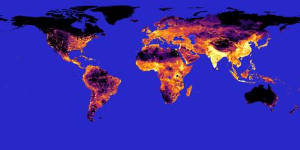
Current state

+ 2 m - 177 million below
+ 5 m - 374 million below
+ 10 m - 785 million below
+ 25 m - 1481 million below
+ 50 m - 2200 million below
+ 100 m - 3093 million below
+ 200 m - 4158 million below
+ 500 m - 5768 million below
Sources: Elevation data is adapted from Mapbox. Population data comes from Gridded Population of the World. Zooming is done using Panzoom.