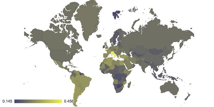
World map of uses Word2Vec to color a world map based on the distance between words and the names of countries. Country names are an interesting way to geocode the semantic values of words though a bit noisy.
Try it out below:

Some examples or try the U.S. State version :
|
Cricket |
Vodka |
Crisis |
Carnival |
Asia |
Desert |
Malaria |
Coffee |
Word2Vec associates a vector with each word by processing large amounts of text. Quite magically these vectors place the words in a semantic space. Words that are close to each other are similar. Not only that, you can do some interesting vector calcualtions. Famously, if you take the vector for the word king, add the vector for the word woman and then substract the vector for the word man, you end up very close to the vector for the word queen.
Google has published a pretrained model which is great. It is a bit unwieldy though and non-trivial to query. So just like with the wikipedia, I decided to import the model into Postgres. You can find the importer on the Github repository for this project. By default, the importer only gets the top 25000 words, which seems to be plenty for most analysis and makes querying faster. It also normalizes the vectors while importing, to make them easier to compare.
Postgres arrays can be queried using the cube_distance(..) function, so we can now find similar words quite quickly.
For example:
SELECT word, cube_distance(cube(vec), cube((select vec from word2vec where word='beer'))) AS distance
Gives us the 5 words that are closest to the word beer.
FROM word2vec
ORDER BY distance LIMIT 5;
By limiting us to only the names of countries, we can get scores that we can then plot on a map giving us a quick visualisation of words and their association with these countries.
For extra cuteness, we also rank the colors Red, Green and Blue against the chosen word and render it in that color. It is not perfect, but wine does become red.
